
Kickstarter hero images. Good, bad and ugly
The main hero image is a massive part of a Kickstarter campaign. It's often the first thing a potential backer will see of your project. So if it doesn’t do its job, people will never even see your incredible video or the expertly-crafted graphics and copy of your project page.
As I said last time, there are some basic practical things you should consider like the aspect ratio and clarity at different sizes, but beyond that, here are more thoughts on the content of your Kickstarter hero image.
…
As you can see below, a typical Kickstarter landing page will have a range of projects displayed at different sizes. If you're lucky enough to be a ‘featured project’ like the one on the left then that’s amazing, otherwise you should focus on what the image will look like at a smaller size and surrounded by other projects. Yours should grab attention.
Remember that people will also usually see your project title next to your main project image. That gives you a chance to add context to the picture and you should make sure they work well together.

Design & Tech desktop landing page on Kickstarter.com
Design projects on mobile browser (L) and mobile app (R)Grabbing attention within the Kickstarter platform is important because a significant chunk of your backers can come directly from Kickstarter, whether that be via general browsing, or by being recommended your project via the website, app or a marketing email.
Beyond that, people getting driven to your Kickstarter page from outside of Kickstarter, such as an online article or an ad, will be won over by strong imagery so it’s important then too.
…
As I was browsing Kickstarter to write this piece, here’s an example of a project that stood out to me because of the project image - Things-Could-Be-Worse Trays.

Things-Could-Be-Worse Trays
Firstly, the hero image is purely showing the product with nothing else to distract you.
This works because it’s a bold graphical product. You can’t really see any of the specific details on the trays, but there’s enough that, along with the project title, I was compelled to click and find out more.
It’s the perfect kind of clever, well-designed product that I think totally suits Kickstarter. And astonishingly in this case, it’s the creator’s 66th campaign!
As of writing, the project has just finished and has raised over $100k.
…
Here’s another image that I came across - this time at a very small format initially.
This is a project for some drinking straws. Not necessarily the most exciting or revolutionary product but I think this project image is great. Bold, colourful and balanced. And again, in combination with the project title you know exactly what to expect.

POCOO Straws project page (inset was how I first discovered it)There are some notable things about this project image, and also the project itself.
Firstly, I think the image is just a graphic or rendering, rather than a photo. This isn’t necessarily a bad thing, but there is a potential risk that it might leave people questioning the readiness of the project.
There is no project video on the page. Again, this isn’t necessarily a deal-breaker, but Kickstarter suggest that there’s a correlation between having a project video and reaching your goal.
From my point of view, the images and copy on the rest of the project page don’t hold together particularly well. Maybe there’s also a challenge here in that the product itself isn’t differentiated enough. However, as of writing, the project looks like the target will be met and I hope it makes it.
…
I don’t want to dwell on the negatives, but here are a few live project images I think could be better.
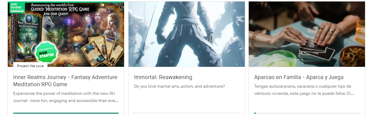
Room for improvementThe first one is a bit of a mess from a graphic design point of view. It’s really hard to decipher what’s going on - when browsing Kickstarter it would be almost impossible to read any of the content there.
Having said that, you may have spotted the big green bar underneath which shows the funding progress. This project is succeeding. They’ve obviously done lots right, and maybe the style of that image appeals to others. And maybe they can get away with it because they have a large existing audience and a strong marketing strategy. But if you’re trying to get organic traffic directly from Kickstarter, then not optimising your project image can just make your job harder.
With the middle one you could almost argue that it’s a good strong image, but to me it just doesn't show anything. And even if you read the title (and subtitle if it happens to be shown where you find it) then you still probably have no idea what kind of creative product is even on offer. Is this a book, a comic, a movie?
And lastly I think this one is actually quite a nice image in terms of structure and layout. However it’s very generic and is basically just people playing cards. It doesn’t draw me in and make me want to join in.
…
I’ll end with the project image I’m least happy with from my own projects.

The Sticker Project, my second KickstarterThis project was for little stickers you stick on your plugs to identify what they’re powering. Frankly, I’m still really pleased with the product idea itself, but as a Kickstarter project it was my least successful.
I’m sure there were many reasons for that, but I think my poor choice of project image played a part. For a start, the actual product itself is tiny within the photo. At least 95% of the image is taken up by peripheral stuff. I think it’s good to show context, but I’d have been better off filling much more of the frame with the product itself.
Another mistake could have been to only use UK plugs in the photo. That might have caused anyone not from the UK to gloss over the image.
Perhaps in another post I’ll dig into more reasons why I don’t think that project went as well as I’d have liked.
…
In the meantime, if there’s anything you’d like me to cover in this blog, or if you’d like specific feedback on your own project, please get in touch.